Yummy Hot Pot
Dine-in Restaurant Food Ordering Web App
About Project
Web App, Website
(User App) / 2023
Deliverables
User Research, Concept Development, Information Architecture, Wireframing and Prototyping, Visual Design, Usability Testing
My Role
Senior UX/UI Designer,
UX Researcher
Project Overview
Yummy Hot Pot is a new restaurant that wants to enhance its customer experience by introducing a seamless food order web app . The app will simplify the ordering process by allowing users to order food by scanning a QR code at their table . This will eliminate the need for sign-up or login. Additionally, users will be able to access their order history and bills for convenience . As a UX/UI designer, I will create an intuitive and user-friendly app design for this project.
Tools
- Miro
- Figma
- Google Meet
- Asana
Team
- 1 UI Designer
- 2 Developers
- 1 Project Manager
Timeline
- Overall: 8+ weeks
- Discovery & Research: 2+ weeks
- Design & testing: 6 weeks
Problem
Yummy Hot Pot wants to improve its customer experience by simplifying the food ordering process. Traditional methods and sign-up requirements cause delays and deter potential users.
Goal
Create an intuitive web app that allows users to scan a table QR code to order food without sign-up. Provide an organized menu, easy order review, and access to order history for a seamless and efficient dining experience.
Challenges
- Limited App Adoption: As few restaurants use food ordering apps in Myanmar, some users may be unfamiliar with how to interact with the app.
- Lack of Mobile Phones: Users without mobile phones might face barriers to using the app, impacting their ability to place orders digitally.
- Initial User Education: Initial User Education: First-time users, especially those unfamiliar with QR code-based ordering systems, may require additional guidance on app usage.
Limitations
- One-Time Use: Users won't have access to order history or preferences for future visits as the app is designed for one-time use.
- Lack of User Profiles: Without user accounts, personalized experiences, order history, and loyalty benefits cannot be offered in this version of the app.
Why web app?
Platform Accessibility: Accessible from any device with a web browser.
Cross-Platform Compatibility: Works on various devices and operating systems.
No Installation Required: Instant access without app store downloads.
Cost-Effective: More affordable than building native apps for multiple platforms.
Easier Updates: Real-time updates without downloading new versions.
Quick Deployment: Rapid launch for faster time-to-market.

My Design Process
Discover
- User interview
- User Research
Define
- Persona
- Empathy Map
- User Journey Map
Ideate
- User Flow
- Information Architecture
Design
- Wireframing
- Prototyping
- Hight Fidelity UI Design
Test
- Usability Testing
- Implementing Feedback
Interview
For user research, we conducted in-depth interviews with two distinct groups: tech-savvy customers (5 individuals) who frequently use food order apps and traditional customers (6 individuals) with limited app experience . Interviews were conducted both in-person and remotely, focusing on preferences, thoughts on QR code scanning, navigation, and desired features for the "Yummy Hot Pot" Food Order Web App.
Surveys
We conducted a Google Form survey for the "Yummy Hot Pot" app, receiving responses from 35 participants.
The survey covered general preferences, comfort with QR code scanners, essential app features, access to order history and bills, and suggestions for improving the dining experience.
Tech-savvy customers shared reasons for preferring food order apps and visually appealing menus, while traditional customers shared challenges with digital ordering systems and app usage.

User insights form interviews and survey:
Convenience: Users want to place orders quickly without the hassle of signing up or logging in.
Order history and bills: Users want to access their order history and bills to track expenses and reorder dishes easily.
Visually appealing menu: Users prefer an app with appetizing images of dishes.
Complex order process: Users are frustrated by the time-consuming and confusing order process.
Unclear navigation: Traditional customers struggle with unclear navigation and instructions.
Slow loading times: Slow loading times hinder users' ability to place orders quickly.
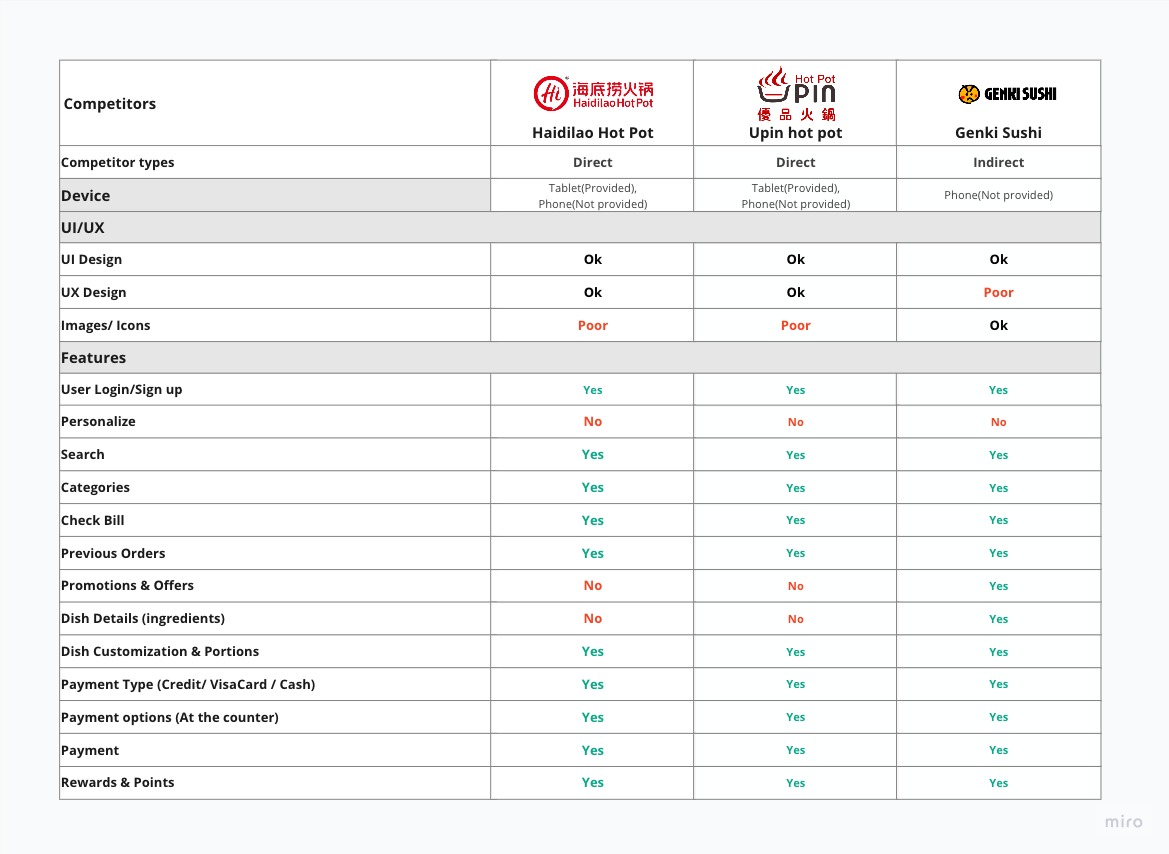
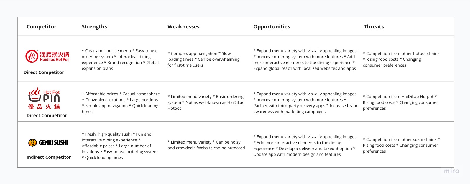
Competitors Analysis
At present, there are no competitors, either direct or indirect, in Myanmar. To gain valuable insights into the competition, we conducted a competitor analysis using restaurants in Singapore as a reference. This analysis focused on understanding their UI/UX strengths and weaknesses. By comprehending their market position, we can make informed design decisions, identify feature gaps, and differentiate our offering. This process greatly influences our design decisions and features.
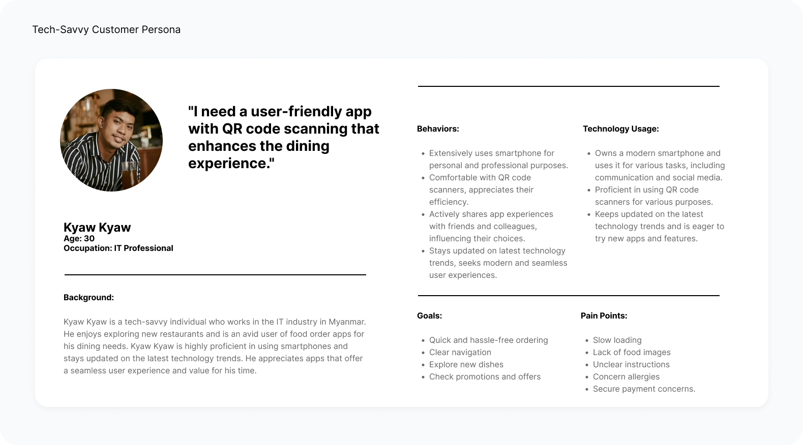
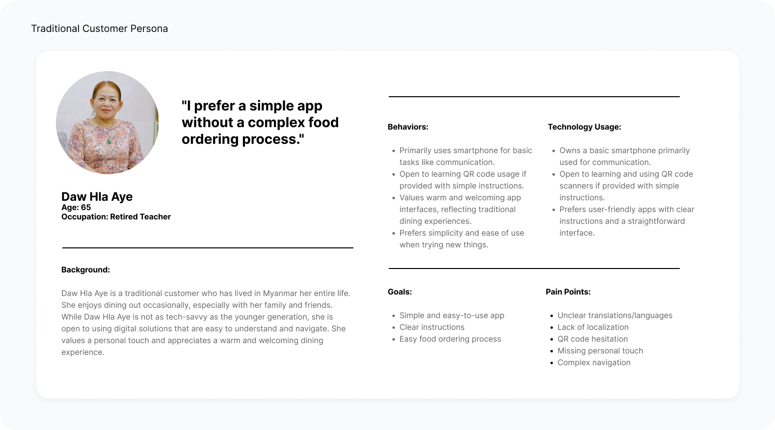
Personas
To understand our users better, we created two personas for each user segment based on interviews and surveys. These personas guided us throughout the project, ensuring a user-centric approach.
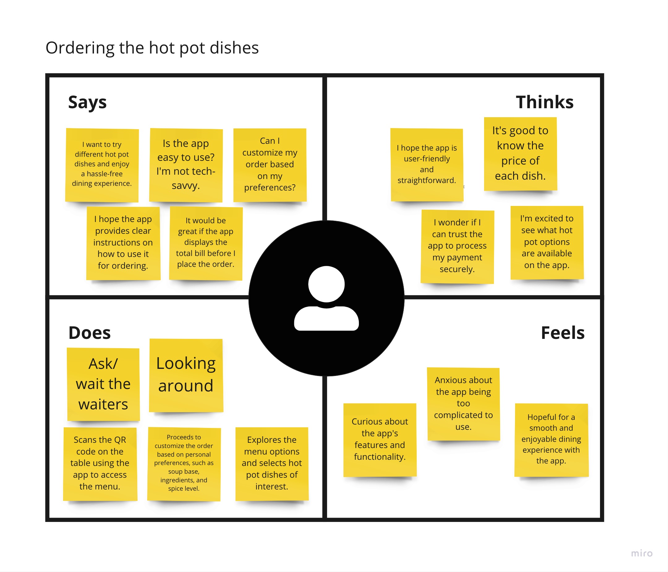
Empathy Map
I created the Empathy Map to gain deeper insights into the users of the app. By understanding their thoughts, feelings, and pain points, I can design a more user-centered experience that meets their preferences and expectations.
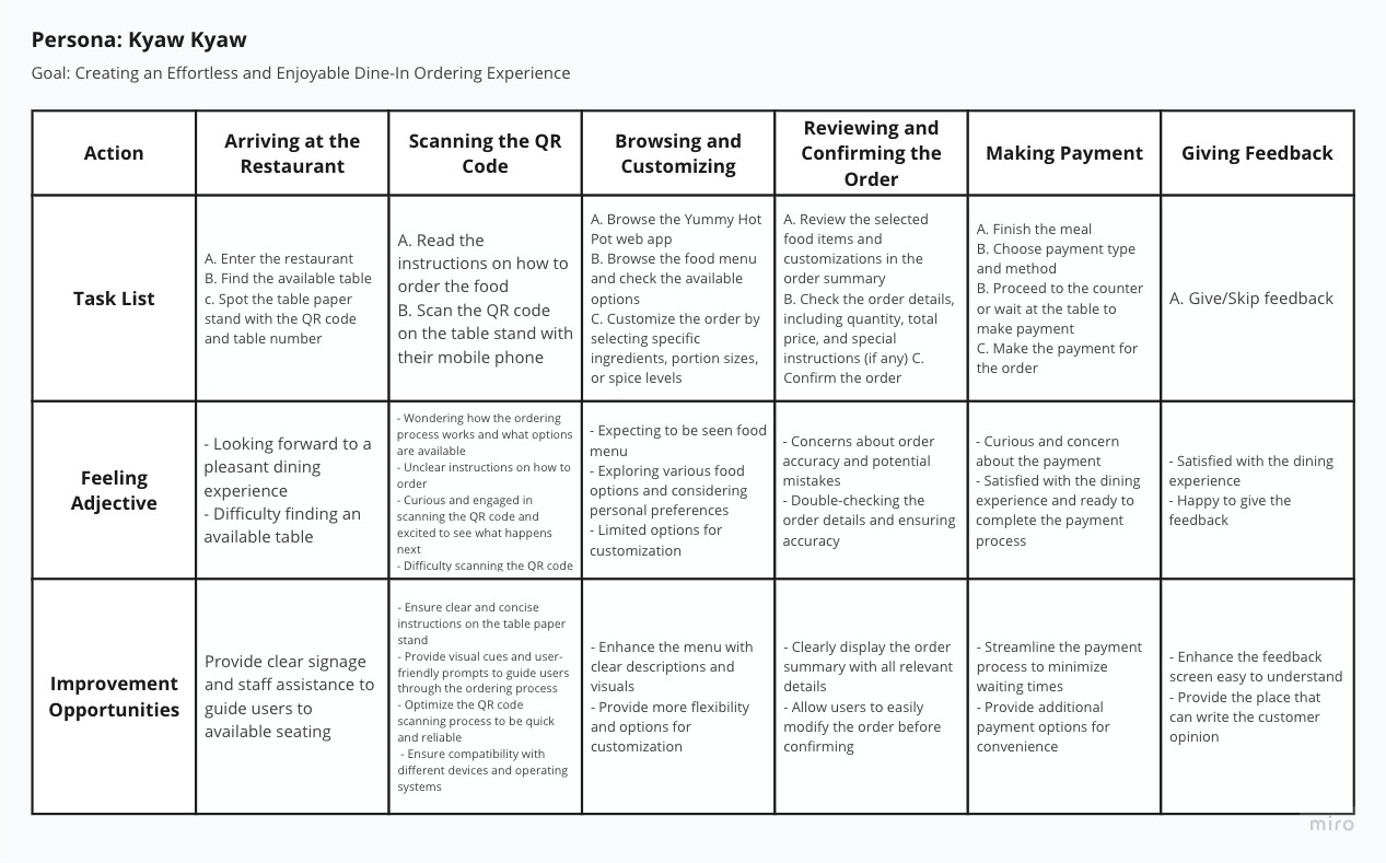
User Journey
With the business goal and user insights in mind, we crafted a user journey map for the Yummy Hot Pot app. The map helps us ensure that our users reach the checkout screen seamlessly, identifying opportunities for improvement in the process.
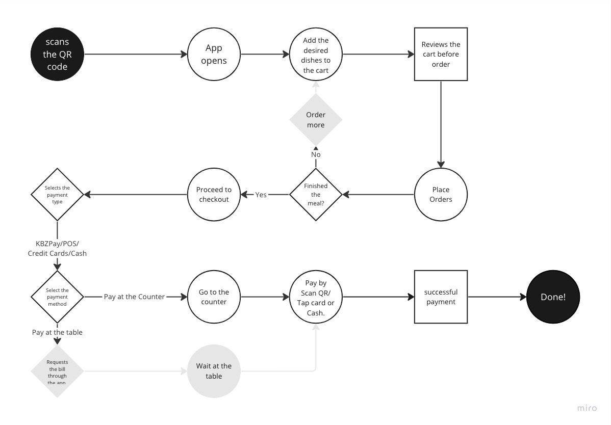
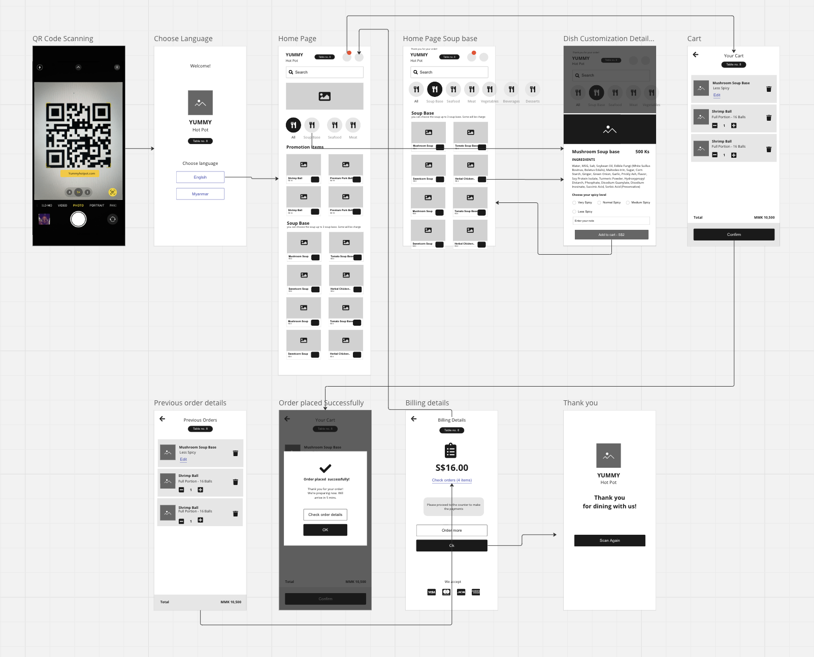
User Flow
After creating the User Journey Map, I developed the User Flow for the "Yummy Hot Pot" Food Order Web App. It outlines the step-by-step process, ensuring a smooth and intuitive experience for users as they scan the QR code and place their orders.
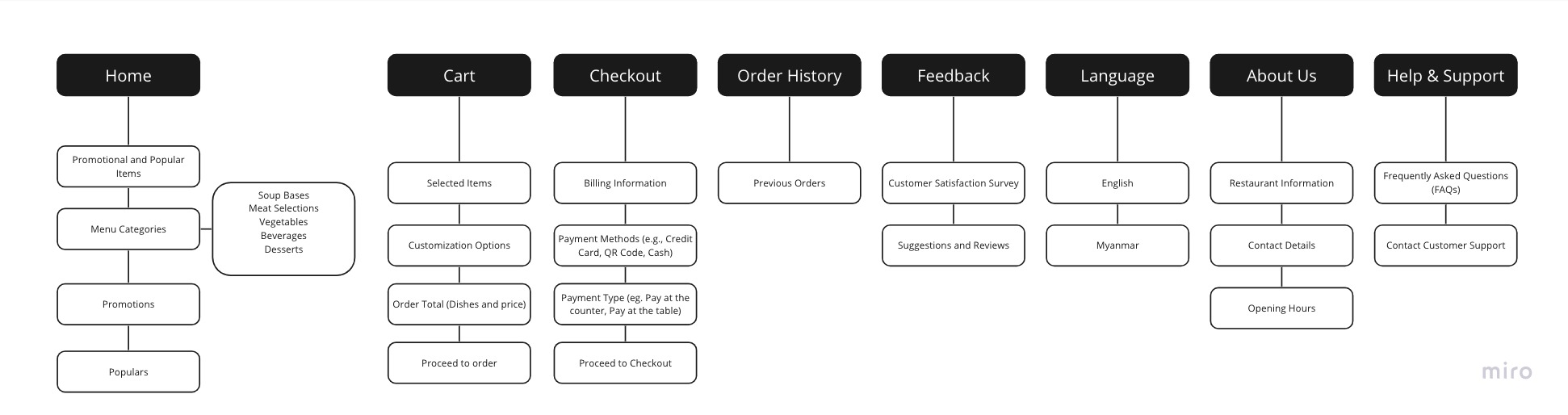
Information Architecture
To organize the content and structure of the "Yummy Hot Pot" Food Order Web App, I created the Information Architecture. It ensures that users can easily access the menu, customize their orders, and view order history without any confusion.
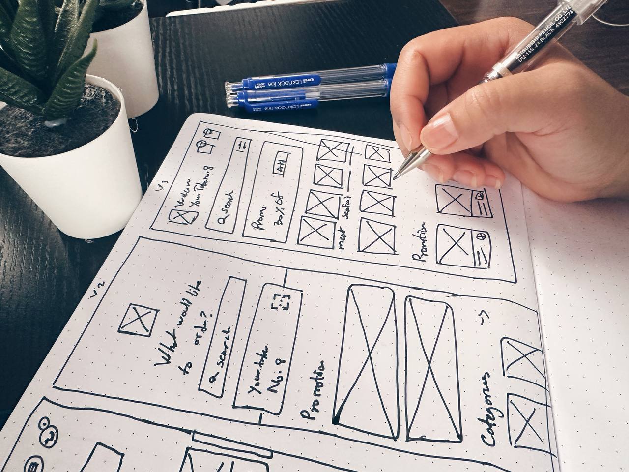
Sketches
I began sketches and wireframes based on user interviews, the business goal, and heuristic evaluation to ensure a user-friendly interface.
Multiple versions of the home page were created with different priorities, refining the design through brainstorming and paper wireframe iterations.
The focus was on intuitive navigation, clear information display, and a streamlined ordering process, aiming to enhance overall satisfaction.
Wireframes
I used Miro to transform my initial sketches into low-fidelity wireframes.
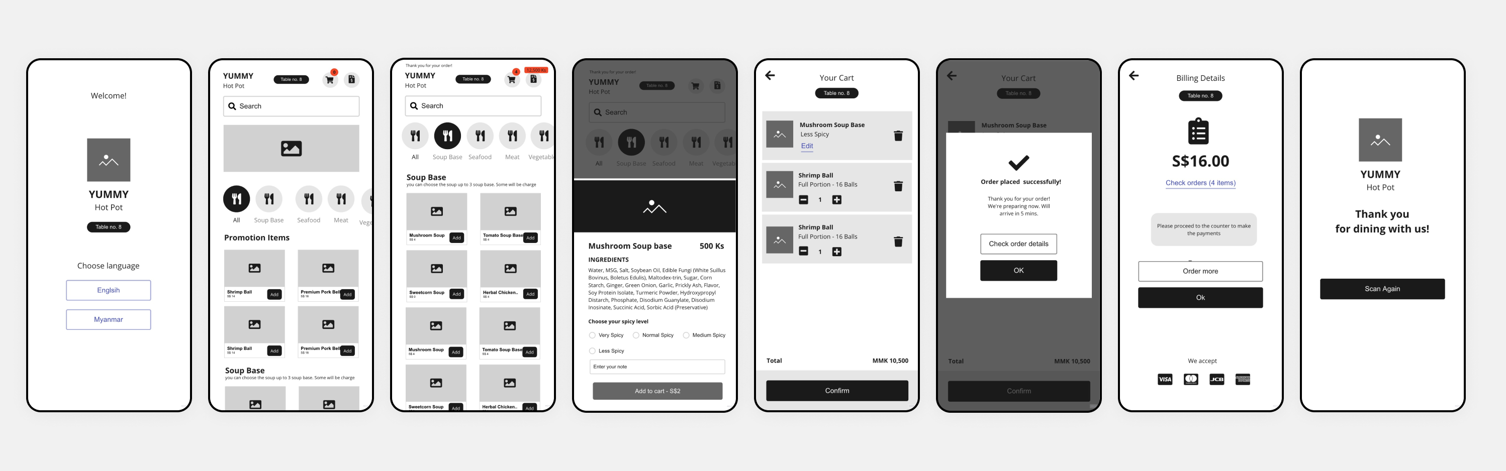
Low-fidelity Prototype
Using the digital wireframes, I crafted a low-fidelity prototype for the primary user flow, including scanning QR codes, ordering dishes, customizing, and accessing billing. It was tested in usability studies.
Usability study: findings
I conducted two rounds of usability studies during the project. The first study guided the design process and refined the wireframes. The second study used a high-fidelity prototype to identify areas for mockup refinement. These iterative studies provided valuable insights for continuous improvement, ensuring a user-centered and optimized experience.
Round 1 Findings
- 1 Users prioritize promotions and offers.
- 2 Users need clearer instructions for efficient order customization.
- 3 Users want to check the bill easily before ordering more.
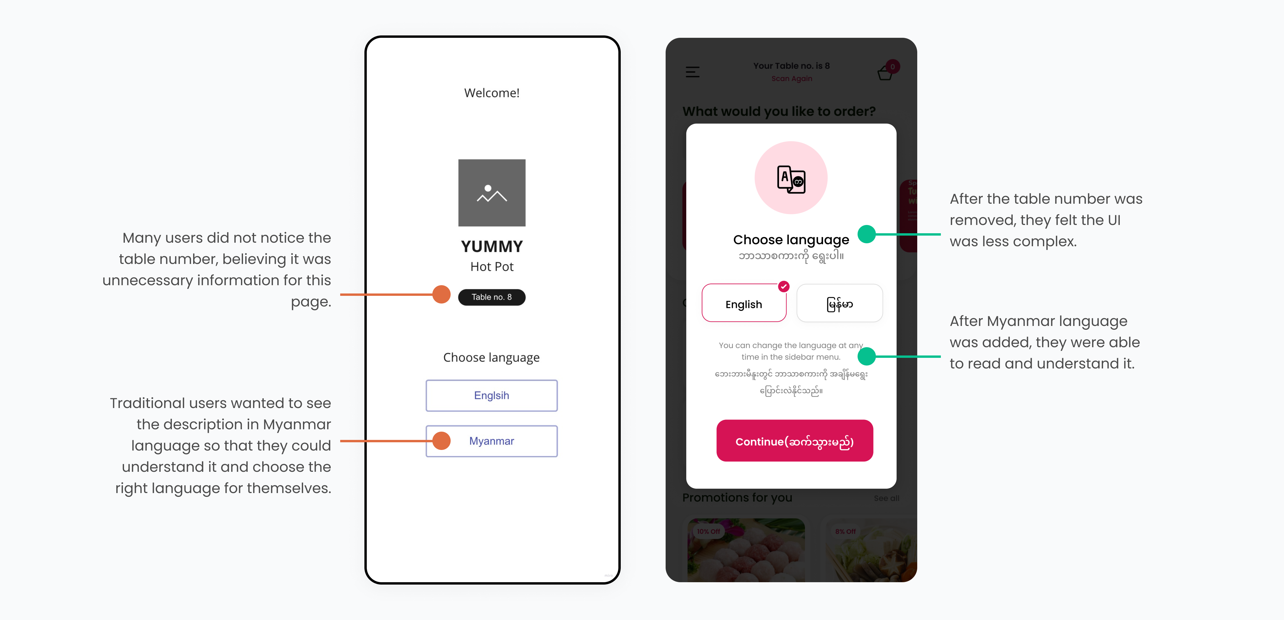
- 4 Traditional users prefer to see the description in Myanmar
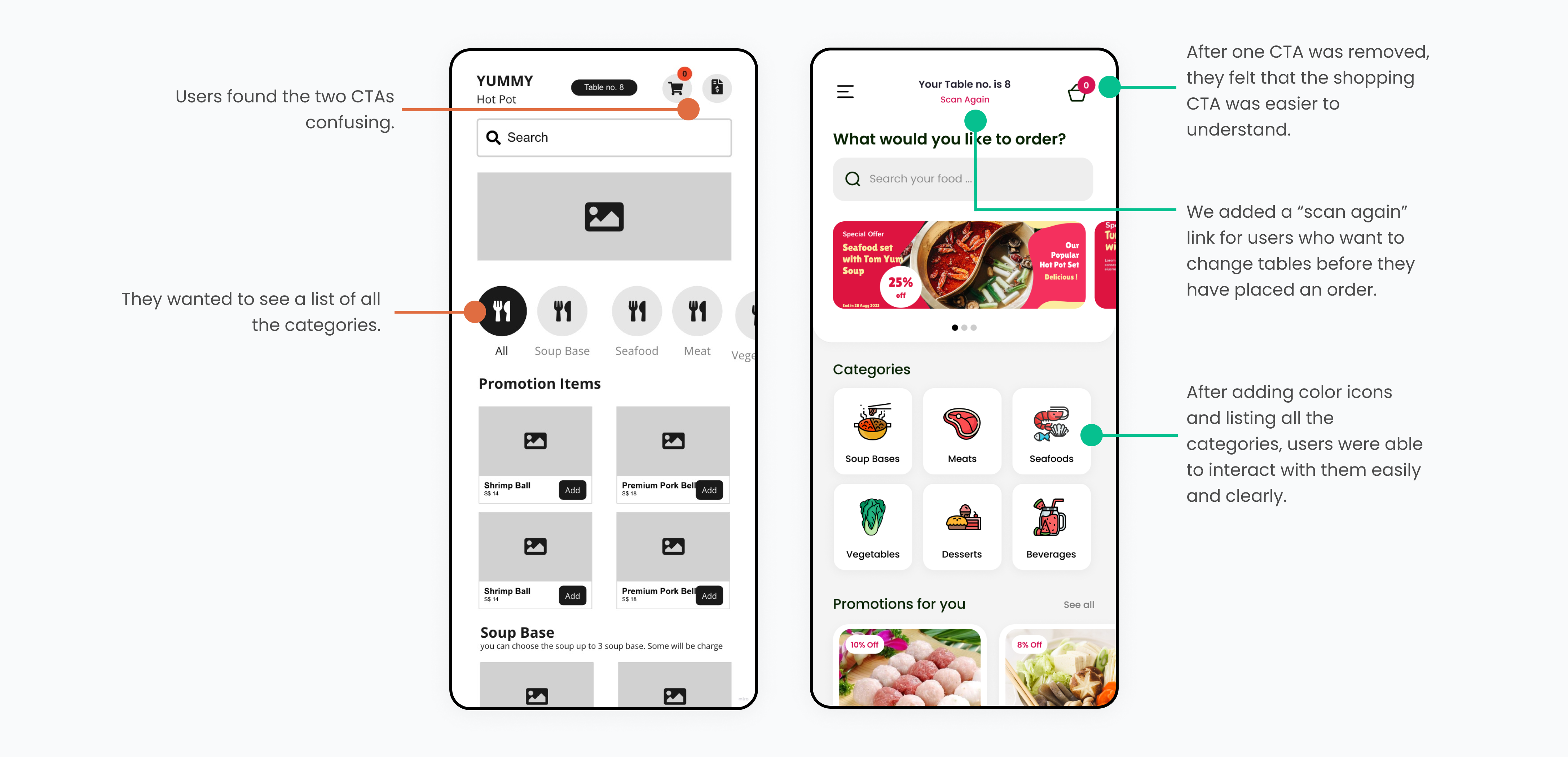
- 5 Users confuse about the two CTAs (Cart and Bills)
Round 2 Findings
- 1 Users want a simplified and clear billing process.
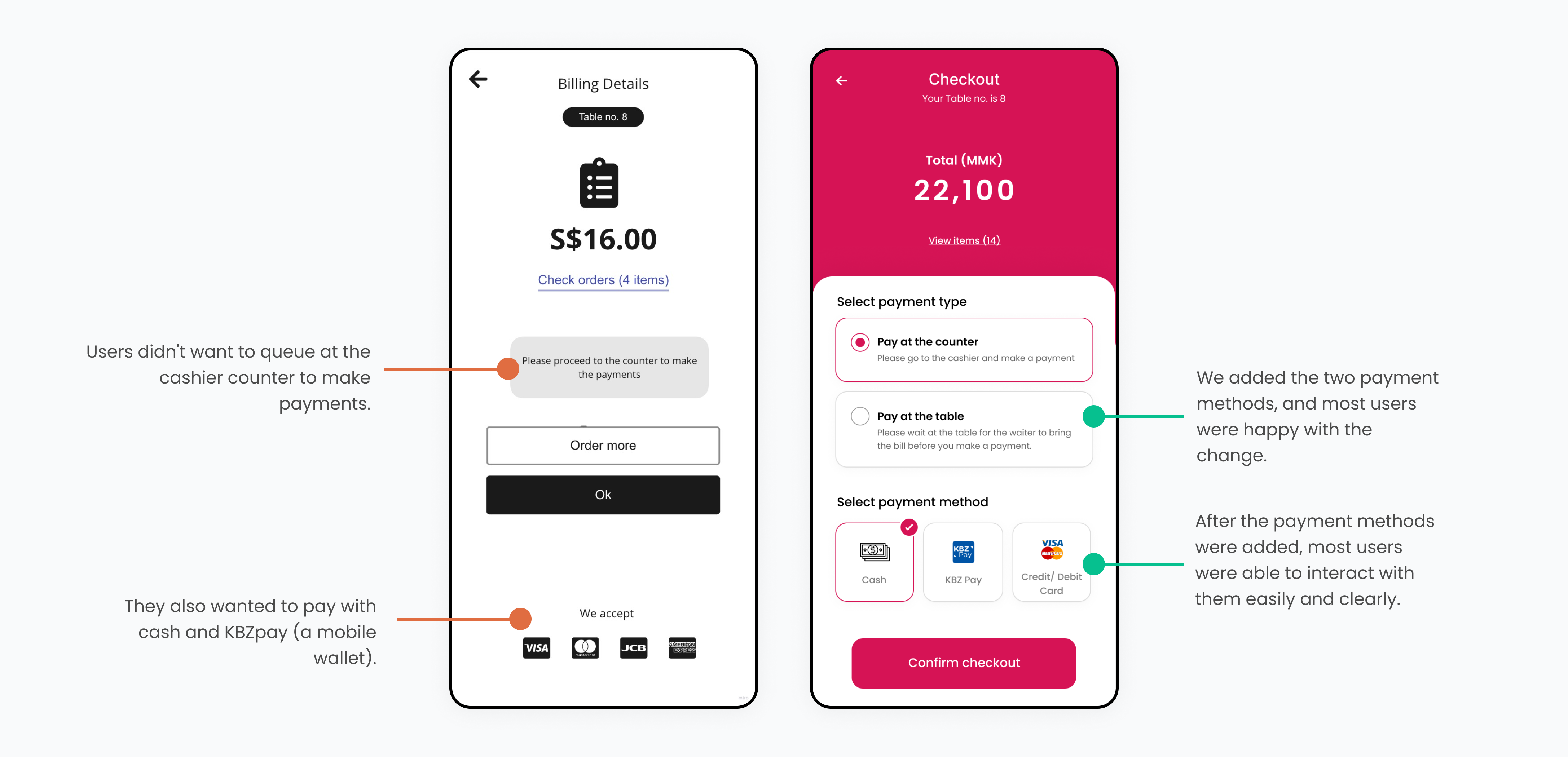
- 2 Users do not want to queue at the cashier counter after a heavy meal, especially if there was a crowd.
- 3 Some users wanted to change tables.
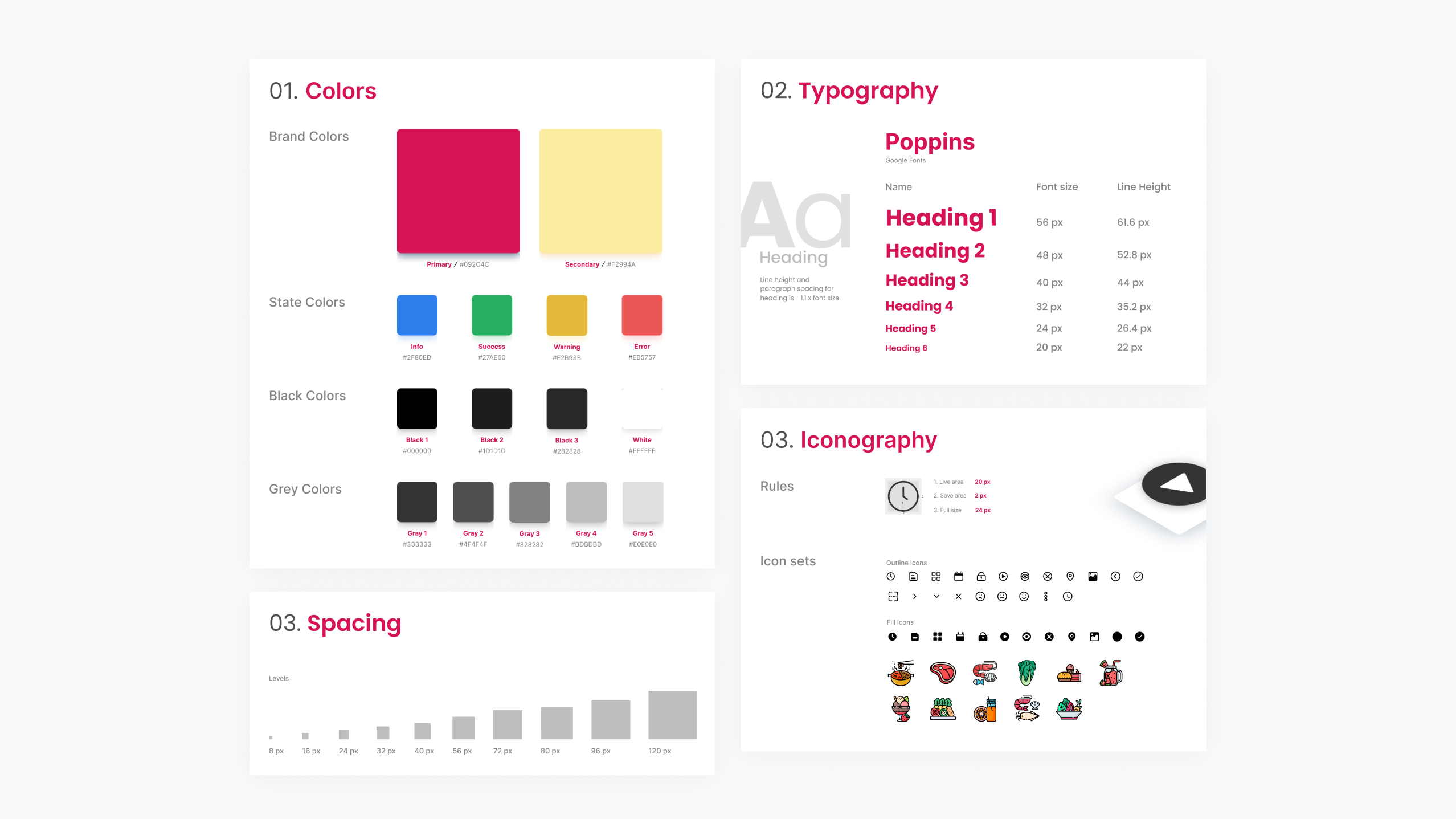
UI Style Guide
After the usability study, I began developing a UI style guide for the high-fidelity UI design, following the Yummy Hot Pot brand guidelines.
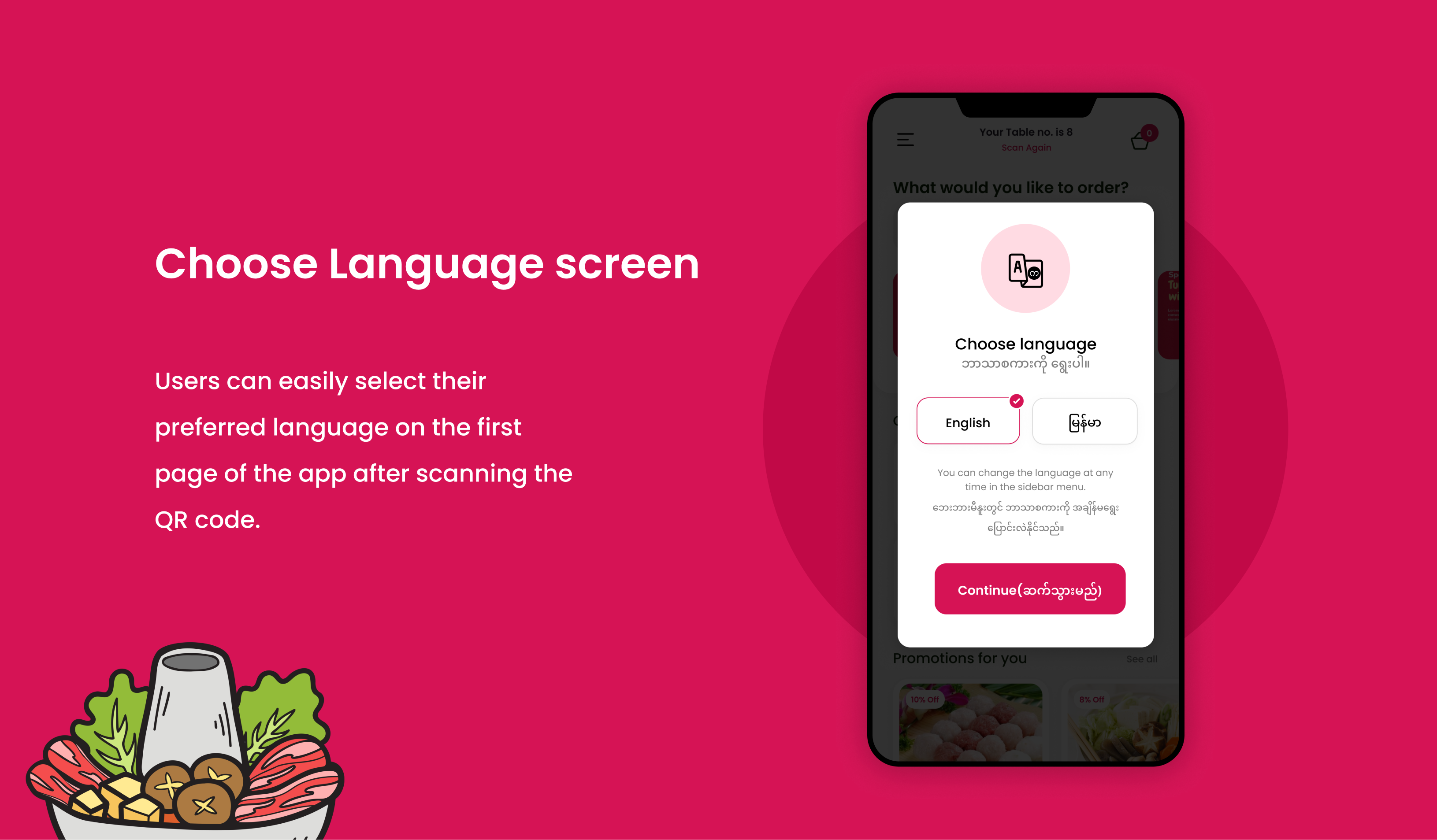
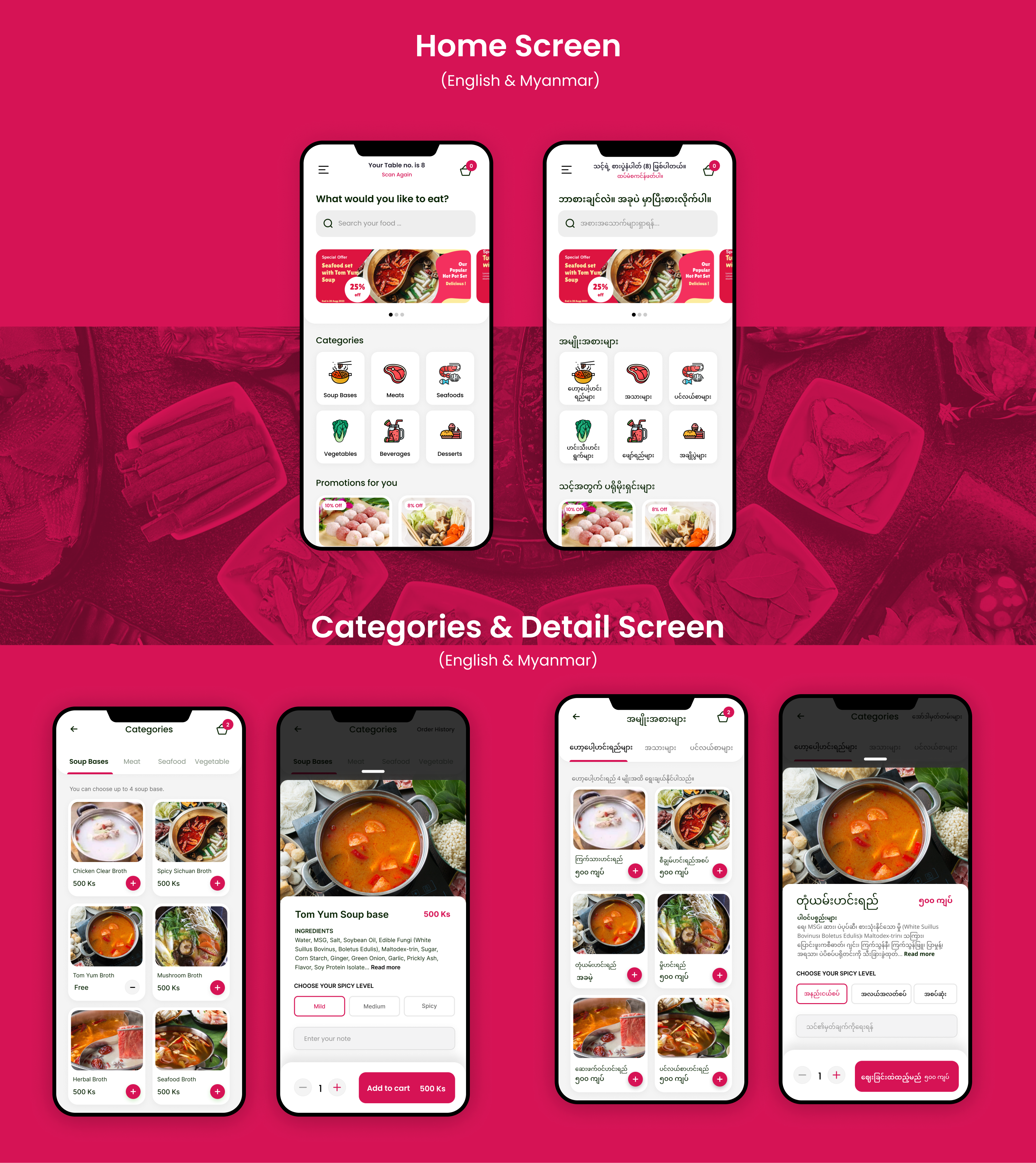
Choose language Screen
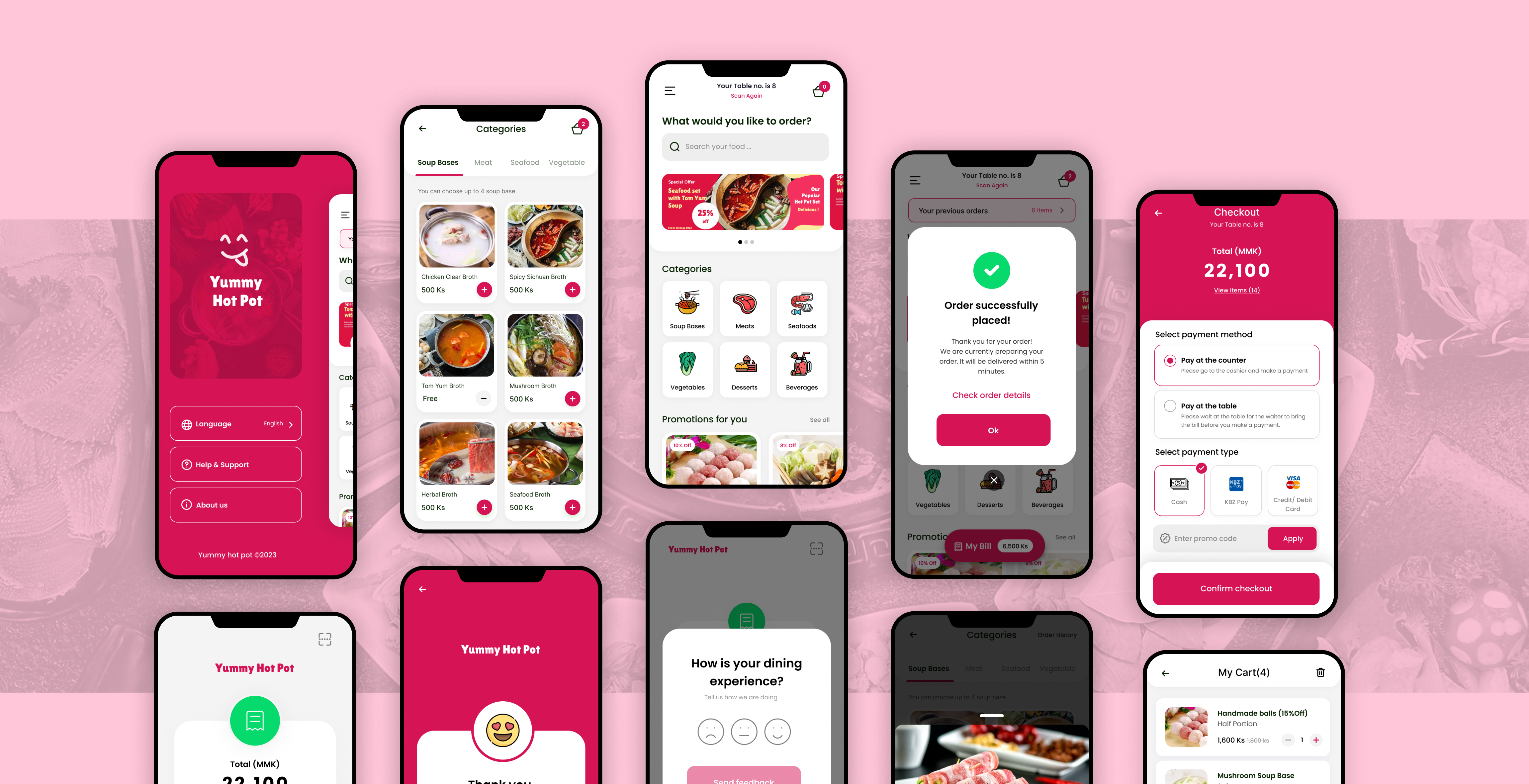
We originally showed the English language on the initial page (the language selection page). However, after a usability study, we found that traditional users preferred to see the description in Myanmar. To solve this problem, we added two languages: English and Myanmar. After two rounds of usability studies, we found that users understood and were happy with the change.
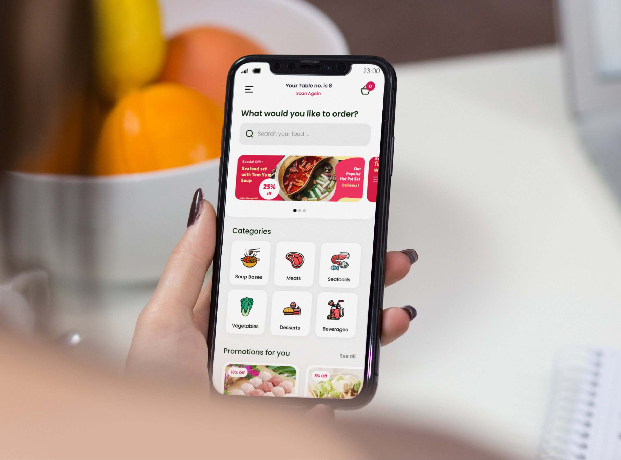
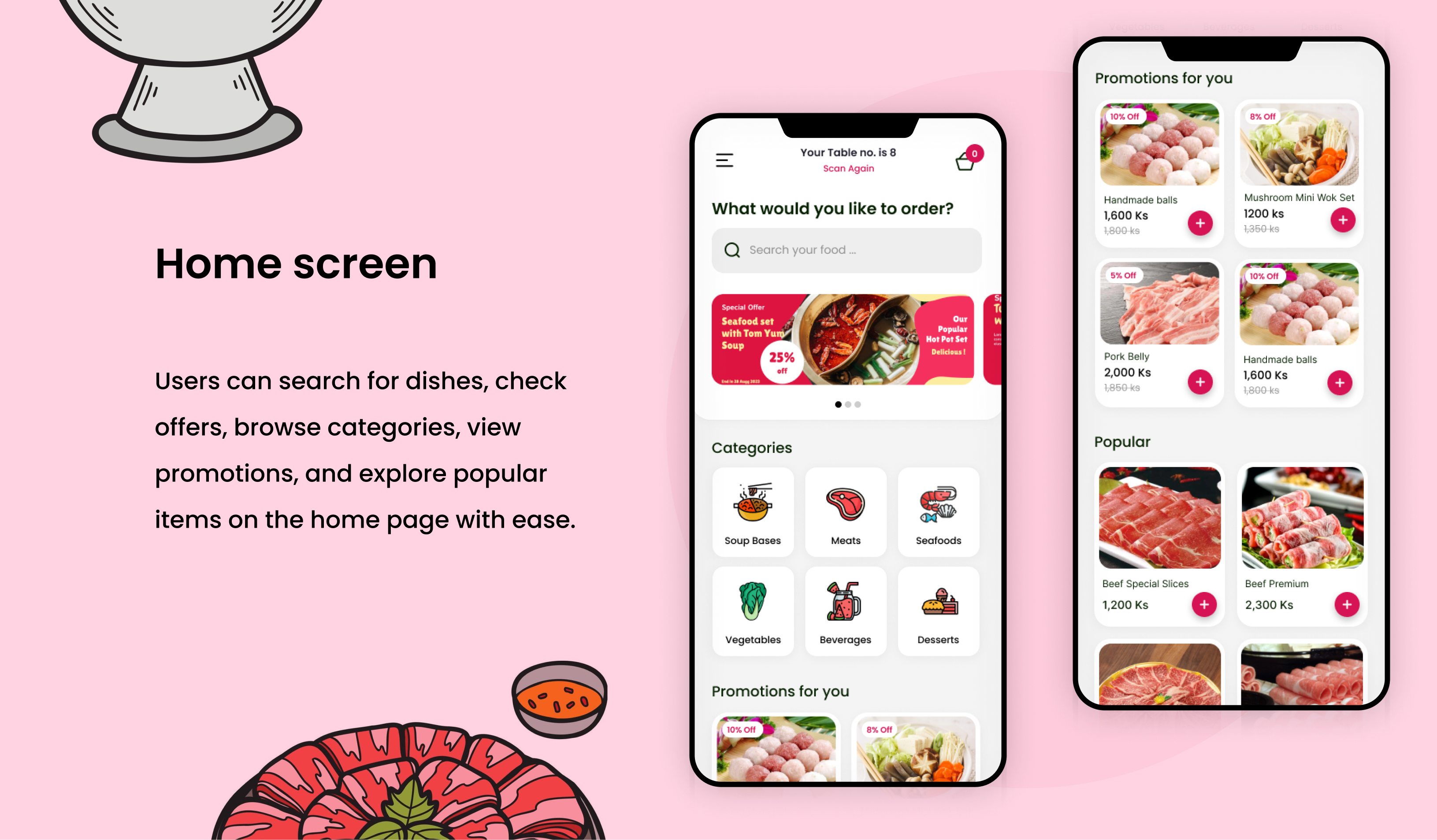
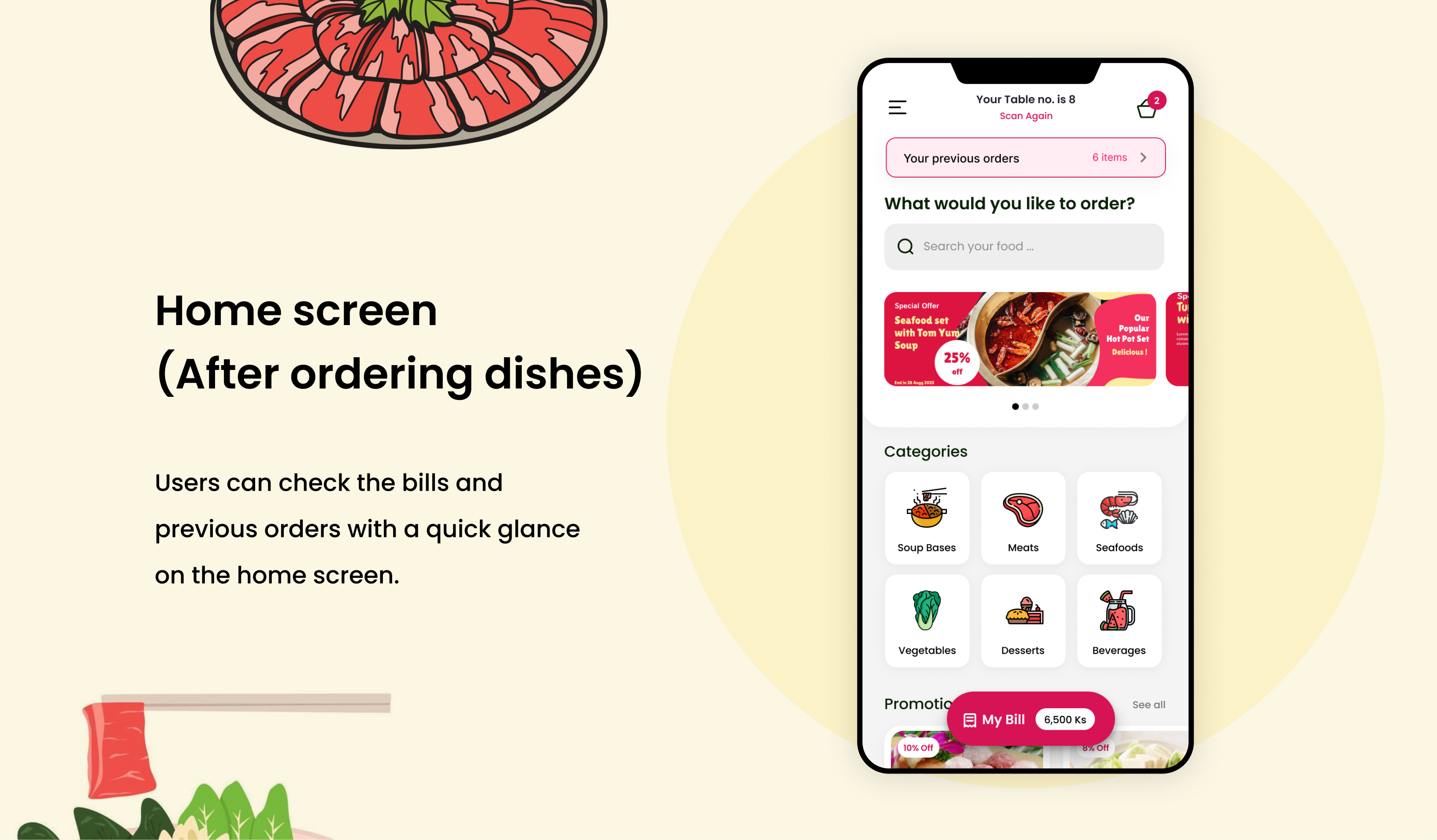
Home Screen
Initially, the two CTAs (Cart and Bills) were placed side by side. However, after a usability study, we found that users were confused about them and the navigation was complex. We also found that some users wanted to change tables. Therefore, we removed the Bills CTA, made some UI adjustments, and added a "Scan again" link for users who wanted to change tables.
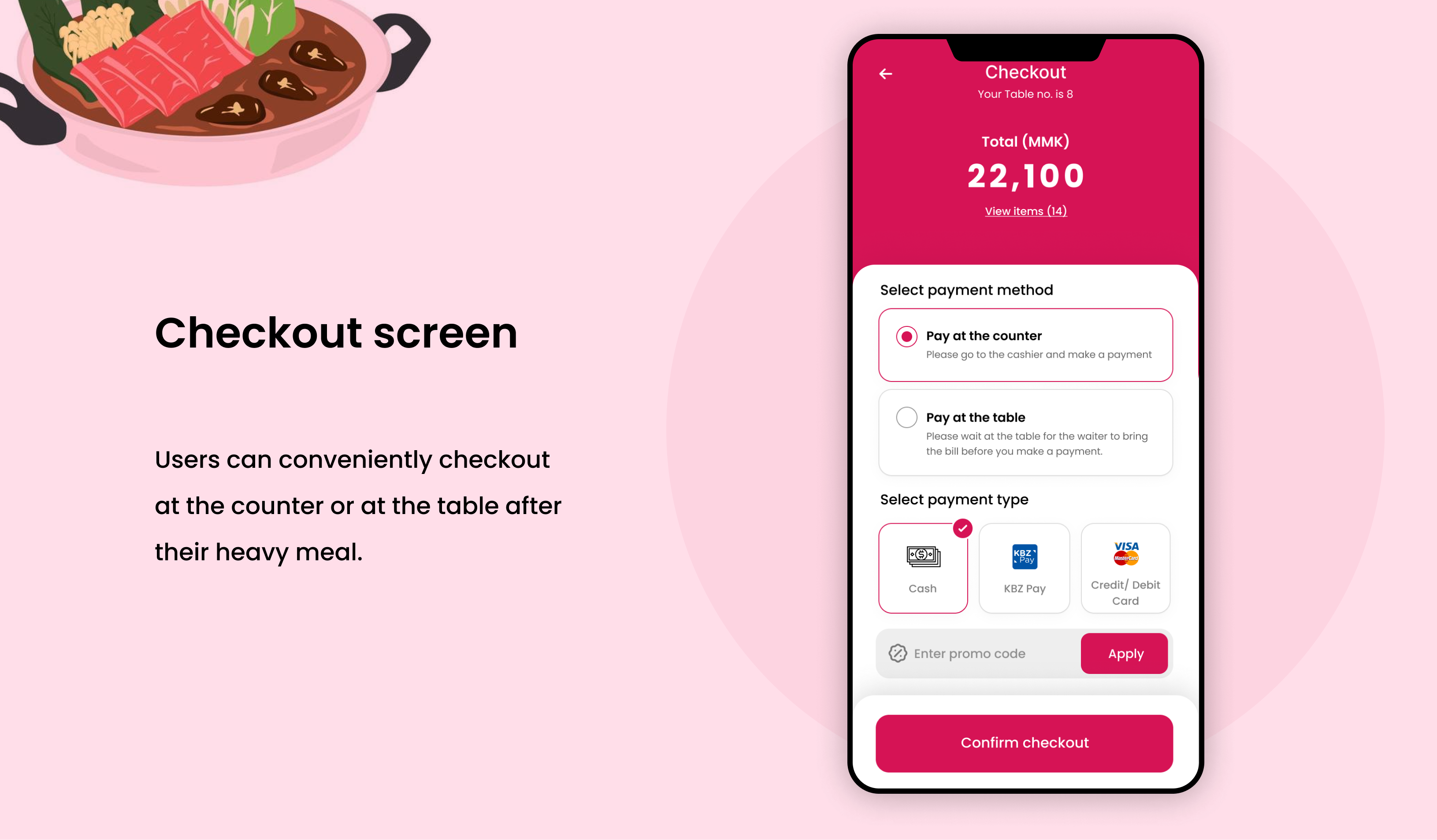
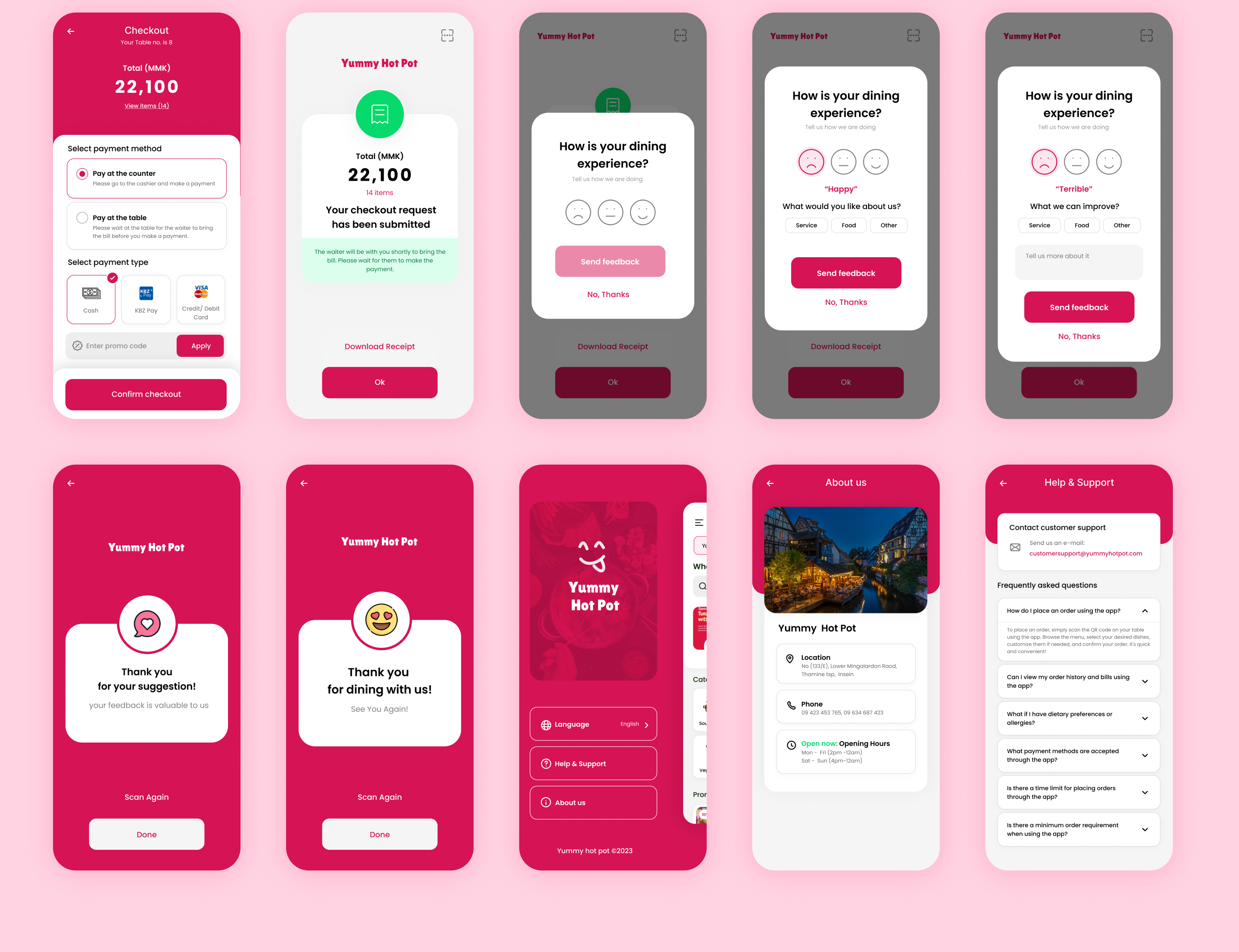
Checkout Screen
Our initial wireframe only showed one payment method: paying at the cashier counter with VISA/Mastercard. However, after a usability study, we found that users did not want to queue at the cashier counter after a heavy meal, especially if there was a crowd. They also wanted to know if the restaurant accepted KBZPay. Therefore, we added two new payment types: Pay at the Counter and Pay at the Table. Users can now choose their preferred payment method themselves.
- Pay at the Counter is the traditional method of paying for your meal after you have finished eating. You will need to queue up at the cashier counter and pay with cash, VISA/Mastercard, or KBZPay.
- Pay at the Table is a new option that allows you to pay for your meal without having to queue up at the cashier counter. When you are ready to pay, you can simply click the "Bill" button and confirm checkout. Your waiter will then be notified and will bring you a POS machine or a QR code that you can use to pay with cash, VISA/Mastercard, or KBZPay.
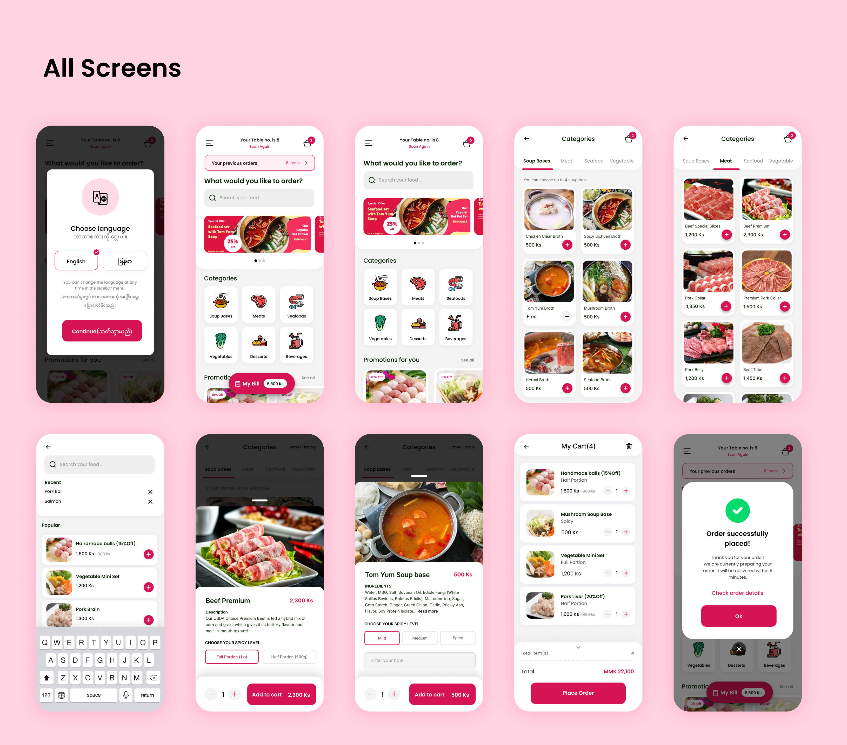
UI Design
Once the usability issues were resolved, I moved on to design the final screens in Figma.
Accessibility Considerations
-
Visual Contrast
Ensured clear color contrast for improved visibility by users with visual impairments.
-
Font Accessibility
Selected legible fonts and adjustable sizes to cater to users with diverse visual abilities.
-
Multilingual Support
Enabled language selection to accommodate diverse language preferences and accessibility needs.
Next Steps
-
01
Implement User Accounts:
Enable users to create personalized accounts to save favorite dishes, track order history, and earn rewards points for a better personalized experience.
-
02
Table Reservation Feature:
Introduce table reservations to minimize waiting times and offer personalized dining arrangements.
-
03
Advance Order Functionality:
Provide users with the option to pre-order meals for efficient and time-saving dining experiences.
Impact
Our designs have received positive feedback from users, with one study participant commenting, "The app's user-friendly interface and intuitive navigation made ordering food a breeze. It saved me time and provided a seamless dining experience." The design improvements have resulted in enhanced user satisfaction and improved efficiency in the ordering process, contributing to a more enjoyable and convenient dining experience for users of the Yummy Hot Pot app.
What I learned:
This project taught me the significance of user customization and enjoyable dining experiences. By understanding how users like to personalize their orders and using visual representations, such as food images, I was able to create a more engaging and satisfying experience. These insights highlight the importance of catering to individual preferences and encouraging users to try new dishes.
You may also like these projects